
How Process Charts Kept the Lights On
A guest writer applies 1940s management to his day job


Editor’s note: State Capacitance is pleased to present How Process Charts Kept the Lights On, by a guest contributor who goes by the name F. Ichiro Gifford and maintains the blog Energy Crystals. He recounts how he applied Work Simplification to his municipal utility. The piece offers a model of how Work Simplification might be applied in the digital era.
How Process Charts Kept the Lights On
On 23–24 June 2025, New England saw a sudden heat wave that forced our local grid operator to take emergency countermeasures to prevent a brownout. My job as a resource analyst at a municipal electric utility is to keep our costs down through engineering-informed financial analysis. High-load days like this spike our internal costs, so if I didn’t handle this, our customer’s electric increases would increase. So I ran a process to reduce our total load during the heatwave.
It was a mess. Fingers were pointed, wires were crossed, and decisions were made at the last minute.
I suspected I had screwed up. Certainly, I thought, this could be done better. I looked for instructions, but I only found disorganized scraps. I asked who ran this program before me—that person had left the company. I was dealing with managerial debt: outdated and poorly documented processes that slow down an organization, akin to technical debt. Procedural knowledge was neither recorded nor optimized—instead, it lived in people’s heads, including employees who left long ago.
I wanted to fix this, but at first, I didn’t know how. Then I remembered State Capacitance’s discussion of Work Simplification: a program started by the Bureau of the Budget in 1942 that offered management training workshops, complete with a handy-dandy pamphlet and a set of posters in an art style we now recognize as “the Fallout look.” These workshops, pamphlets, and slick-looking posters trained bureaucrats—people like me—to face managerial debt head-on. Not only did it train them in specific methods for improving processes, but it offered a better vision of operational excellence.
These pamphlets are no joke. I used one of these tools—the Process Chart—to improve this peak response process at my day job.
It worked.
The Process Chart
The Process Chart is a standardized form used to break out business processes into individual steps with type classifications. A manager would write a Process Chart, step-by-step, for any business process in his office—large or small, important or not. Each step would get classified into one of four buckets. These four buckets were written for an era in which staffers literally moved stacks of paper between desks, so I’ll give you the updated set that I developed:
Large Circle (O): Operation. Creating, changing, adding to something.
Small Circle (◦): Message. Emailing, messaging on Teams, pinging on Slack. Also make a note of who gets the message.
Triangle (△): Storage. Saving a file. Also make a note of the file path where files are stored.
Square (▢): Inspection. Checking and verifying, but not (typically) changing.
The manager lists each step of the process with the following information:
The step’s category: Operation, message, storage, or inspection.
What the step entails. The more specific the better.
Who performs the step. Name backup staff where applicable.
Simple Enough, Right?
Of course not.
Let’s look at the “before” chart, adapted slightly for public consumption. We can call this process the “Peak Shredder” program—I’ve learned from customer programs that having a funny name is half the battle.
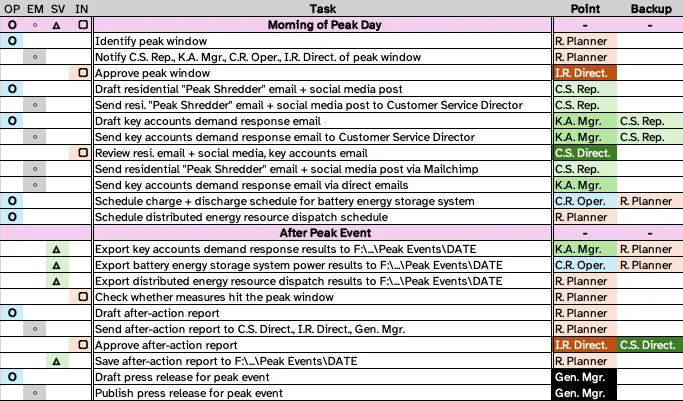
This process currently involves: me, the Resource Planner (R. Planner); the Integrated Resources Director (I.R. Direct.); the Customer Service Representative (C.S. Rep.); the Key Accounts Manager (K.A. Mgr.); the Customer Service Director (C.S. Dir.); the Control Room Operator (C.R. Oper.); and the General Manager (Gen. Mgr.).
Wait, Is This The Process?
The Work Simplification pamphlet recommends that, after creating an initial Process Chart, you should stare it down and ask who-what-where-when-why. I’ll just quote the pamphlet here:1
Remember you are looking for ways to eliminate, combine, rearrange, and simplify steps. For that reason, question each detail of the process. Ask yourself what purpose each one serves. So ask yourself these questions:
What is done? What are the steps? Do I have them all? What does each step do? What are the surrounding facts?
Why is this step necessary? Can as good a result be obtained without it? Is it an absolute must? Don’t be misled by an excuse when you are looking for a reason.
Where should this step be done? Is it done in the right sequence? Can I combine or simplify by moving this step ahead or back?
Who should do the job? Is the right person handling it? Or is it more logical to give it to someone else?
How is the job being done? Can it be done better with different equipment or different layout? Can I make this job easier for everyone concerned?
With that framework in mind, let’s identify some problems in the Peak Shredder process.
Some of This Doesn’t Need Spot Checks
The Process Chart makes this issue immediately apparent. Count ‘em: seven emails! A big contributor to that count is (frequently unnecessary) reviews by leadership. When I walked through the Process Chart in a meeting, I learned that the emails the Customer Service Director signed off on were templates. The Customer Service Representative generated them simply by changing the date and time and then running the Mailchimp. They hardly needed the Director’s attention, let alone his signature.
Similarly, the Integrated Resources Director had been needlessly approving the peak window, despite the fact that the process had already been automated. Most electric utilities have built-in tools for predicting demand peaks; either we get that tool bundled with some utility control software, or we write a tool ourselves. The Integrated Resources Director doesn’t need to look at the same dashboard I am looking at and say “…Yup.” He can simply receive the notification email like everyone else.
Some of This Can Be Automated
During the initial peak event, I learned that I actually didn’t know how our distributed energy resource management system (DERMS) worked. We slapped together a passable dispatch schedule ourselves, but as I built my Process Chart, I learned that the DERMS had tools for automating this. The automation tool could receive our peak window messages, autonomously calculate a dispatch schedule, run it without our involvement, and auto-dump an event log into a file path of our choosing. I no longer had to do this by hand. I barely even had to look at it!
This, ultimately, meant that I could take one more task off my plate. Which was for the best, considering how much of this process turned out to be my responsibility.
Some of This Can Be Standardized
During that same Process Chart meeting, I learned that the messages sent to key accounts are pretty much all the same: “Hey, a peak is coming at this time, you know the drill, call me if you have questions.” In practice, these emails and phone calls were done informally by whoever had the closest relationship with a given facilities manager. These key account peak notifications can become a form email. In fact, we can use the same form email we send to residential customers! These key accounts do, in fact, know the drill. If they really have questions, they already know whom to call.
We had inadvertently replicated a management technique from yet another 1940s government initiative: Forms Control, a method for reviewing paperwork in order to streamline processes. In our case, looking at the template emails alongside the operational instructions enabled us to consolidate our communications down to one email that we sent to everyone, both residents and key accounts.
By this same principle, we found that the after-action press release was also amenable to a template. This means the General Manager doesn’t need to write a new one each time—I can simply run a template, cut and paste a few numbers, and let the General Manager sign it.
Tying Everything Together with a Functional File
All told, the new Process Chart looks something like this:
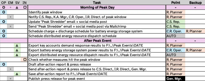
Much better—we managed to cut out nearly half the steps and emails!
Moreover, simplifying the Peak Shredder program gave us more than just a Process Chart. It led to better documentation of each step that we improved. After the Customer Service Representative showed that some emails could become form letters, she wrote one up and sent it around for review. After I asked the Control Room Operator how to control a battery we use for the program, he graciously wrote up an instruction manual for it.
All told, the simplification effort taught us to think operationally about the Peak Shredder program, which led us to independently recreate what the Forms Control manual called a functional file. The core insight from the manual was: because a process consists of gathering, operating on, and communicating information, an operationally excellent organization ought to consider all those documents at once. The functional file is a collection of everything related to a process.
In our case, the functional file held every form, every R script, and every template letter. Just like in the 1940s, locating everything about a process in one place enables employees to review and improve it, such as by identifying duplicative forms. As the original manual puts it:
Forms are a reflection of the work methods, operating procedures, and management know-how which give rise to their use. If an agency’s forms constitute a simple, orderly plan showing clear and related purposes, there is reason to believe that personnel—knowing whatever they are doing and why—may be giving reasonably efficient service. If, on the other hand, its forms constitute an unintelligible tangle of red tape, it is pretty safe to assume that its methods and procedures—its service to the public—are in much the same shape.
Finally, I had to find a good home for this process file within a graveyard of inconsistent permissions, poorly-labeled folders, and legacy Excel files from 2005. My organization’s managerial debt showed itself again in our file management system. But that is a problem for another day.
Operational Guidance, Not Top-Down Oversight
My experience with Work Simplification and Forms Control was a chance to address managerial debt at my utility. But even more than that, it made me understand debates at the federal level about punitive and legalistic approaches to controlling the bureaucracy (such as the Paperwork Reduction Act). They’re doomed from the start, and for the same reason that “strategic guidance” never works: they’re written by people who refuse to understand operational practice.
Top-down dictums to “just do it better” never work because the people at the top can’t lead operational improvement. They don’t know what needs to be done, because they do not (and should not) wade into the muck of front-line processes. Ideally, strategic leaders (and members of Congress!) would allow operational staff—project managers, supervisors, field officers, people like me—to iron out the devil-harboring details of their Big Ideas. But instead, these leaders hand down needless impositions and wasteful spot checks, as if they could do my job better than I can.
Operational staff don’t need dictums. We need tools. We need best practices. We need training on Work Simplification, on Forms Control, on being better managers. This isn’t rocket science—these materials were prepared and disseminated in the ‘40s and ‘50s, and they worked. Government bureaucrats weren’t more talented or harder-working back then, they were managed better. And they were managed better because their managers were taught operational excellence and pushed to achieve it.
We can only fix government dysfunction with real accountability. Pushing vague modernization initiatives from on high is not accountability. Requiring permission to send a survey is not accountability. Throwing a fit when a staffer suggests a cleaner approach is not accountability.
Teaching freshly-promoted managers how to achieve operational excellence and then letting them do it—now that’s accountability!
Editor’s Postscript
The author has kindly made available the Excel template he created for Process Charting. You can view it here. It will open in Google Sheets, so download it as an Excel file (the .xlsx file extension).
This and all quotes are found in: Public Administration Service. “Work Simplification as Exemplified by the Work Simplification Program of the U. S. Bureau of the Budget.” R. R. DONNELLEY & SONS COMPANY, 1949.
 | A guest post by
|